Logos
The more consistently a logo is used, the stronger the recognisability of the brand becomes. To achieve this, always use the logo files listed below and follow the rules for good application.
Use the pdf version of the logos whenever possible. The pdf versions can be scaled to any size, without loss of definition or quality.
Jpeg and PNG are suited for use in on screen presentations and webpages. A PNG version has the advantage of a transparent background.
Standard full colour logo
Always try to use this full colour version of the logo. It is the best representation of the brand.
One condition is that the logo should always be placed on a white background. Only when that is not possible you may use the black & white versions of the logo.
| File | Use and filetype |
|---|---|
| REScoopeu-logo.pdf | Print design |
| REScoopeu-logo.png | On screen |
| REScoopeu-logo.jpg | On screen |
Symbol
For use as secondary branding option or for small/compact circular or square areas, like social media avatars.
| File | Use and filetype |
|---|---|
| REScoop-symbol.pdf | Print design |
| REScoop-symbol.jpg | On screen |
| REScoop-symbol.png | On screen |
Black & white logos
When to use:
- When it's not possible to place the Standard logo on a white background. Instead, you can use the black or white version of the logo on a coloured or photographic background.
- When there are technical limitations for using the Standard full colour logo. (Like screenprinting, fax, low definition applications...)
- When the Standard full colour logo is already used in your layout, the white or black version of the logo can be used as secondary branding, signoff or detail.
| File | Use and filetype |
|---|---|
| REScoopeu-logo-black.pdf | Print design |
| REScoopeu-logo-black.jpg | On screen |
| REScoopeu-logo-black.png | On screen |
| REScoopeu-logo-white.pdf | Print design |
| REScoopeu-logo-white.png | On screen |
Small sizes
The logo should at least be 25mm wide when used in a print design. Or 100px wide for on screen usage.

Placement
The logo shouldn't be placed too close to other layout elements or page borders. The minimum distance is the height of the last "E" in ".EU" on all sides of the logo, as shown in the image.

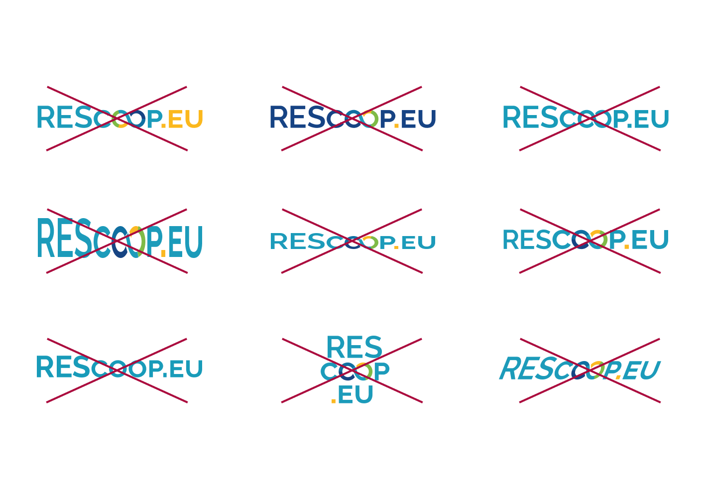
Don'ts
- Do not alter the logo files in any way.
- When scaling the logo, keep all proportions as is.
- Keep the colours and colour order as is.
- If a size, colour version or configuration of the logo isn't fit for the use you intended, please use another provided version of the logo and avoid altering it yourself.
Need a version of the logo that is not offered here? Contact the REScoop.eu communications manager.
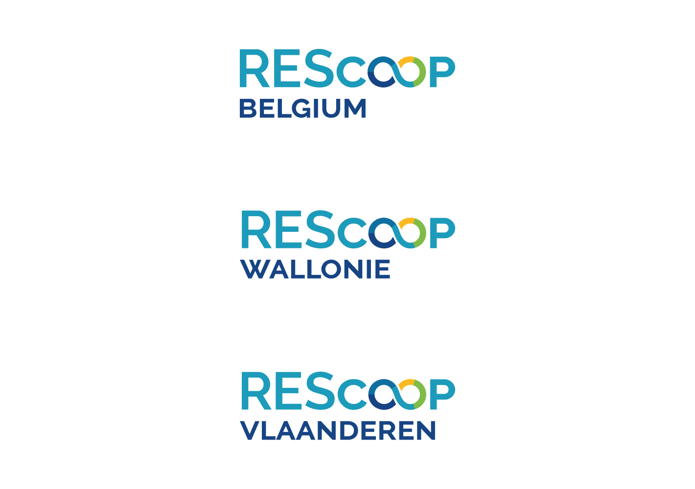
Federation logos
The REScoop federations are a derivation of the REScoop.eu logo.
| File | Use and filetype |
|---|---|
| REScoop-Belgium.pdf | Print design |
| REScoop-Belgium.png | On screen |
| REScoop-Belgium.jpg | On screen |
| REScoop-Belgium-black.pdf | Print design |
| REScoop-Belgium-black.png | On screen |
| REScoop-Belgium-black.jpg | On screen |
| REScoop-Belgium-white.pdf | Print design |
| REScoop-Belgium-white.png | On screen |
| REScoop-Vlaanderen.pdf | Print design |
| REScoop-Vlaanderen.jpg | On screen |
| REScoop-Vlaanderen.png | On screen |
| REScoop-Vlaanderen-black.pdf | Print design |
| REScoop-Vlaanderen-black.jpg | On screen |
| REScoop-Vlaanderen-black.png | On screen |
| REScoop-Vlaanderen-white.pdf | Print design |
| REScoop-Vlaanderen-white.png | On screen |
| REScoop-Wallonie.pdf | Print design |
| REScoop-Wallonie.jpg | On screen |
| REScoop-Wallonie.png | On screen |
| REScoop-Wallonie-black.pdf | Print design |
| REScoop-Wallonie-black.jpg | On screen |
| REScoop-Wallonie-black.png | On screen |
| REScoop-Wallonie-white.pdf | Print design |
| REScoop-Wallonie-white.png | On screen |