Colours
Besides a logo and fonts, the colours you use in your communications contribute to the recognizability of the REScoop.eu brand.
They can also be used as a playful element in your design.
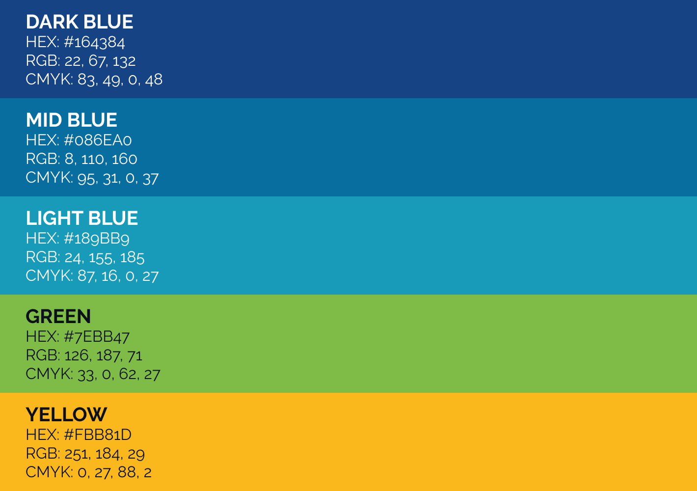
Standard brand colours
These five are used in the REScoop and also inform the main color scheme for your design.
It is best to work with a lot of white space, for a fresh appearance, but you can also use large areas of color.
The 5 colours are inspired by the natural elements and are often used thightly together in a 'rainbow' formation, to represent the ideas of 'community' and 'progresssion'.
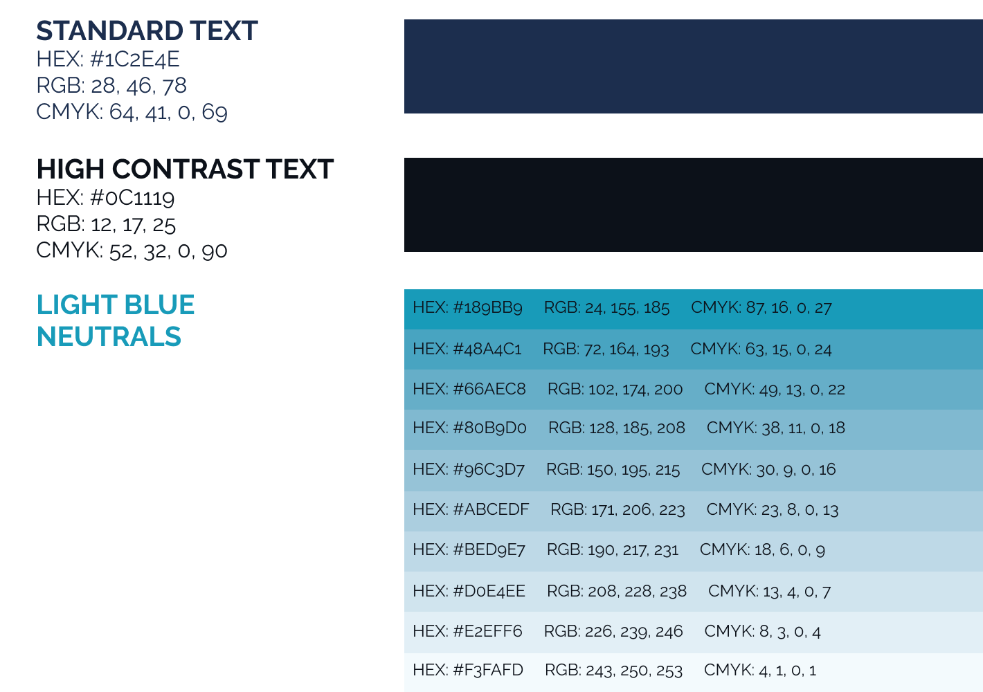
Neutral colours
The REScoop visual identity avoids black and grey colours. It's just no fun!
Instead, we use a variety of blues to set text and create subtle backgrounds and variations
The "Standard Text" colour is the default colour used instead of black.
If you need higher contrast for your texts, the "High Contrast Text" colour can be used.
In text editors or layout applications with limited formatting options, you could use pure black, but avoid grays.
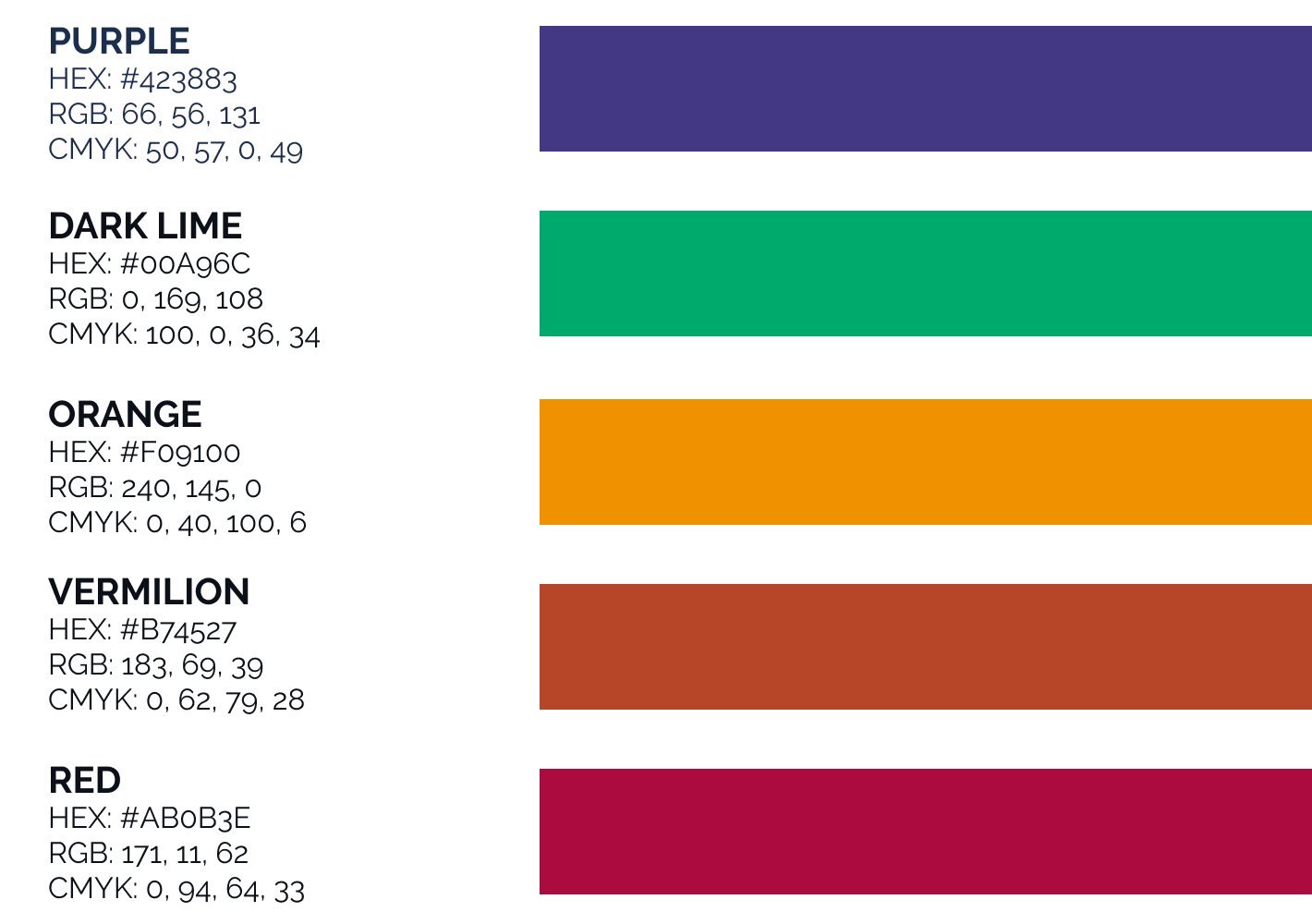
Secondary colours
For use in illustrations, icons, REScoop project logos or anything else that needs to stand out next to the 5 standard brand colours.